 Robert Venturi,
 John Rauch and Scott Brown (VRSB) is a Philadelphia firm that has had a significant influence on late 20th-century architecture. The firm was founded in 1964 as Robert Venturi and John Rauch by partners Robert Venturi and John Rauch. They were joined in 1967 by Denise Scott Brown who since 1960 had been collaborating with Robert Venturi in teaching and the development of theory. In 1980, the firm became Robert Venturi, John Rauch and Scott Brown.
The firm's influence was first felt through the writings of Robert Venturi and Scott Brown, beginning with Venturis Complexity and Contradiction in Architecture widely regarded as the seminal document of the postmodern movement. Published in 1966, it is still in print and has been translated and published in nine languages.
Vanna Venturi's House
Vanna Venturi House, även kallat Chestnut Hill House, är ett mindre bostadshus i området Chestnut Hill i Philadelphia, Pennsylvania (USA). Huset ritades av arkitekten Robert Venturi som fått uppdraget att rita en bostad åt sin mor Vanna Venturi. Villan byggdes mellan 1962 och 1966 och var ett av Robert Venturis första uppförda byggnadsverk och kom att bli startskottet i dennes arkitektkarriär. Byggnaden stod klar i samband med publikationen av Venturis postmodernistiska manifest Complexity and Contradiction in Architecture och bär tydliga spår av dessa idéer i sin utformning. Av många anses den som den allra första postmoderna byggnaden.

Arkitekturen är komplext och lekfull och utforskande och innehåller många historiska referenser och stilelement, vilka dock konsekvent har omtolkats och tillspetsats. Planen utgörs av en relativt långsmal rektangel och använder sin bredsida som huvudfasad. Taket har formen av ett delat sadeltak med gaveln åt bredsidan. Den rektangulära exteriören står i kontrast mot interiörens sneda väggar och buktande ytor och en hög detaljrikedom som utstrålar Venturis motto "Less is a bore ". I bottenvåningen ligger köket, badrummet, vardagsrummet och moderns sovrum, medan det på övervåningen finns en takterrass och ett gästrum. Den öppna spisen i vardagsrummet har en kraftig murstock som accentueras även exteriört av ett upphöjt skorstenstorn.


 This image shows the information and idea I have referred from other sources in order to design my building.
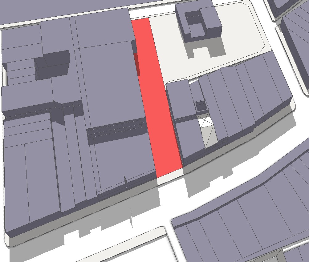
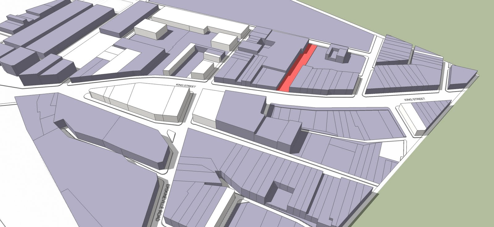 This is the model of the entire site constructed using Google-sketchup
 The design of this building is inspired by the oil painting by Jan Vermeer, ‘Woman Weighing Peals’. The young woman in the painting is weighing pearls, standing between the dark background of ‘the Last Judgment’ and the jewelry on the desk.
 The balance that she holds has nothing on it, representing that she is comparing and balancing the weights and importance of ‘materiality’ and ‘spirituality’. It seemed that she had reached her conclusion.
 1. The studio in which the pregnant in the painting works, serves as a prayer room with capacity of two people only, the pastor and the person praying. The studio is supported by pillars and it is on the second floor, isolated and quite.
 Vanna Venturi House, även kallat Chestnut Hill House, är ett mindre bostadshus i området Chestnut Hill i Philadelphia, Pennsylvania (USA). Huset ritades av arkitekten Robert Venturi som fått uppdraget att rita en bostad åt sin mor Vanna Venturi. Villan byggdes mellan 1962 och 1966 och var ett av Robert Venturis första uppförda byggnadsverk och kom att bli startskottet i dennes arkitektkarriär. Byggnaden stod klar i samband med publikationen av Venturis postmodernistiska manifest Complexity and Contradiction in Architecture och bär tydliga spår av dessa idéer i sin utformning. Av många anses den som den allra första postmoderna byggnaden.
 Arkitekturen är komplext och lekfull och utforskande och innehåller många historiska referenser och stilelement, vilka dock konsekvent har omtolkats och tillspetsats. Planen utgörs av en relativt långsmal rektangel och använder sin bredsida som huvudfasad. Taket har formen av ett delat sadeltak med gaveln åt bredsidan. Den rektangulära exteriören står i kontrast mot interiörens sneda väggar och buktande ytor och en hög detaljrikedom som utstrålar Venturis motto "Less is a bore ". I bottenvåningen ligger köket, badrummet, vardagsrummet och moderns sovrum, medan det på övervåningen finns en takterrass och ett gästrum. Den öppna spisen i vardagsrummet har en kraftig murstock som accentueras även exteriört av ett upphöjt skorstenstorn.


.jpg)


